Crafty Bug

Handmade with love

  • Crafty Stuff
  • Baking
  • Papercraft
  • Sewing
  • Wool
  • Special Offers

Top Embroidery Tweets this Week

March 21, 2017

Here’s this week’s roundup of my favourite spots on Twitter.

1. Fabulous Fawn

This embroidered fawn all curled up asleep is absolutely irresistible!

https://twitter.com/DopeArtz/status/837806517386629120


2. Super Sunset

This beautiful sunset caught my eye on a wet and grey winter’s day.  It just oozes relaxation.

Diamond embroidery #mosaic #craft kit. Boating at sunset. https://t.co/4GhBmkVTwZ #giftsforhim pic.twitter.com/VJEiyeOx5a

— Cathy Williams (@TySiriolCeramic) March 5, 2017


3. Magic Milky Way

This looks pretty awesome to me.  And really unusual.

I have just done one space embroidery so far, (and it's my only one on felt) but I love it! #milkyway #sciart pic.twitter.com/rOCpeVMxVX

— embroidology (@embroidology) March 4, 2017


4. Delicate Decoration

Oh so pretty! Oh so delicate! Oh so my colours!

Swatch of an embroidery made by Lesage for Schiaparelli, ca. 1939. Courtesy @lesartsdecora… https://t.co/X8ZjnGagKd pic.twitter.com/G4q6CXHDvX

— European Fashion Heritage Association (@EurFashion) February 24, 2017

National Quilting Day Highlights

March 18, 2017

We’ve gathered together here some of the best tweets celebrating National Quilting Day.

1. Shakespeare Quilt

We think this is just brilliant!

For #nationalquiltingday, the beautiful Shakespeare quilt that was on display at the @LAPublicLibrary for #thebardgoeswest. pic.twitter.com/Vw4CBgRCNw

— victoriabernal (@victoriabernal) March 18, 2017


2. Coffee & Quilting Anyone?

For those of you who are coffee addicts.  And appreciate a great quilt, too!

#Coffee #nationalquiltingday Photo Source: https://t.co/C0mL29scdT pic.twitter.com/qazhXGkKrt

— Kim Zampirri (@KimZRealEstate) March 18, 2017


3. A Quilt for Canine Lovers

No matter what type of dog you have, we've got the ideal pet barrier for you. https://t.co/2mmVQYRLd5 #NationalQuiltingDay #quilting #dogs pic.twitter.com/E7658bXlUx

— PetBarrier (@pet_barrier) March 18, 2017


4. And one for Cat Lovers!

Just to re-dress the balance of course!

Awww, if you search for pet #quilting patterns, you'll find #adorable #patterns like this one! #NationalQuiltingDay pic.twitter.com/P52Y71pTSC

— VetDepot.com (@VetDepot) March 19, 2016


5. A Scrap Map!

Love the idea!

https://twitter.com/thelilgreenbean/status/711356597407121409


6. A Colourful Quilt

#NationalQuiltingDay pic.twitter.com/FFOwCHi6Zo

— SmartChoice AZ,NV,NM (@InsAgentSupport) March 19, 2016


7. Appalachian Bright

Just because I love it.

Happy #NationalQuiltingDay! Quilting is a BIG part of Appalachian culture. Photo Credit: Bob Richmond pic.twitter.com/PlqIZnTBsP

— Heartland Rentals (@HeartlandCabins) March 19, 2016

St Patrick’s Day Shamrock Shake Cupcakes

March 15, 2017

I’d never seen milkshake flavoured baking until I noticed an advert from Mr Kipling on the TV for strawberry milkshake cakes. These much more interesting looking Shamrock Shake Cupcakes are a novelty for St Patrick’s days, the recipe below is adapted from the American one found at BakingBites.com

Vanilla and Mint Flavoured Shamrock Shake Cupcakes

Shamrock shakes are the bright green, vanilla and mint flavored milkshakes that McDonald’s rolls out in the USA for St Patrick’s Day every year. The shakes have something of a cult following, even among people who aren’t usually getting milkshakes at McD’s. These Shamrock Shake Cupcakes are inspired by the seasonal shakes and are a fun dessert to serve up around St Patrick’s Day.

The cupcakes are buttermilk cupcakes flavored with vanilla and peppermint extracts, then dyed with green food coloring. Vanilla and peppermint is a great combination that gives the cupcakes a sweet, round minty flavor, rather than making them taste like mouthwash, which can happen if you are overzealous with your peppermint extract. For the food coloring, you can use either a liquid coloring or a gel coloring. The gels are more intense and you won’t need to use as much to get your desired color, but liquid colorings are more widely available at grocery stores and are still a good choice. You’ll have to eyeball the color as you add the dye to get the color you want, however, as food coloring varies a bit by from manufacturer.

The cupcakes are moist, dense and flavorful, with just the right amount of mint. I used lightly sweetened whipped cream instead of regular frosting as a nod to the real milkshakes. Whipped cream is light and contrasts well with the cupcakes. You can use homemade whipped cream, but storebought does the job here just fine. The unfrosted cupcakes can be stored in an airtight container for at least a day or two before serving, if you want to make them ahead of time, but the whipped cream needs to be applied right before serving because it won’t hold up at room temperature for long periods of time. Add a few green sprinkles and a short straw before serving, then enjoy!

The Recipe

Makes 12

Ingredients

  • 175g plain flour
  • 1 tsp baking powder
  • 1/2 tsp bicarbonate of soda
  • 1/4 tsp salt
  • 80g butter at room temperature
  • 200g sugar
  • 2 large eggs
  • 2 tsp vanilla extract
  • 1/2 tsp peppermint extract
  • 1/4 – 1/2 tsp green food coloring
  • 80ml buttermilk
  • lightly sweetened whipped cream and green sprinkles to decorate (cream in a spray can is great for this)

Method

  1. Preheat oven to 180C (350F). Line a 12 hole muffin tin with paper liners.
  2. In a medium bowl, stir together the flour, baking powder, bicarbonate of soda and salt.
  3. In a large bowl, cream together butter and sugar until pale and creamy, then beat in eggs, vanilla extract, peppermint extract and green food coloring until ingredients are well combined. Add additional green food coloring as needed.
  4. Stir in half of the flour mixture, followed by the buttermilk. Mix in the remaining half of the flour mixture, stirring until no streaks of dry ingredients remain visible.
  5. Divide mixture evenly into the prepared muffin cases.
  6. Bake for 16-20 minutes or until cupcakes are set and a toothpick inserted into the center of a cupcake comes out clean or with only a few moist crumbs attached. Turn out onto wire rack to cool completely.
  7. When you are ready to serve the cupcakes, top each with whipped cream and green sprinkles. Do not “frost” cupcakes until ready to serve.

For other St Patrick’s Day cake inspirations, take a look at our round up of all things green here!

Pressed Flower Cards for Easter

March 13, 2017

I came across this post by Beata Ryta in which she shows off her Easter Joy cards.  As you can guess from the name, they were created by her to give to friends and family for Easter and her hope was, of course, that they would bring joy to the recipients.  Looking at her beautiful cards, I’m sure any receiving one would have felt very special to have had such a lovely card made for them.

The cards have been made using pressed spring flowers such as narcissi and irises.  These have worked really well in the flower vase design used by Beata and are just like receiving a bunch of flowers – except they last much longer!

By using pressed flowers Beata has created a pleasing 3D effect, and the use of spring flowers gives the cards a proper Easter seasonal feel to them.

Beata’s page on her Easter Joy cards can be found by following this link.

For different more Easter card inspiration have a look at our Easter Crafts page.

Dress Your Sewing Machine

March 11, 2017

Everyone likes to dress up, right?  So why shouldn’t your trusty sewing machine join in the fun? I’ve recently spotted a blog post which provides a pattern and instructions to do just that.  I’m sure you’ll agree from the photo above that this is a really pretty design, with a well chosen fabric and lots of added detail.

Not only is this visually attractive but there is has a practical aspect too, as the cover protects your machine from dust and helps keep it as good as new.  And as you’ll see from the post, some rows of decorative stiches are included to remind you of all possibilities you may wish to incorporate into future projects.

Check out the full article and have a go at the project yourself by clicking here.

Finding the Illustrator behind the Loreto Embroideries

March 10, 2017

I have set out for you below, an article by Mary Corbet from her website regarding her “discovery” of the designer of the Loreto Embroideries.  If you are interested in ecclesiastical embroideries, then you will find this article quite fascinating.

In it, Mary explains that, while exploring the work of one Ezio Anachini in relation to illustrations of Dante’s Divine Comedy, she saw his postcard illustrations depicting the titles of the Blessed Virgin in the Litany of Loreto.  By comparing these illustrations to the embroideries she is of no doubt that it was Anachini’s illustrations which inspired the Loreto Embroideries.

Take a look at Mary’s reasoning in her article here and see if you agree:

I want to take you on a little exploratory excursion into the art and illustration behind a famous collection of embroidered panels. Being rather the curious sort, I tend to fall into little rabbit holes when I start exploring, and sometimes, the results can be rather serendipitous!

In 2015 and 2016, the Royal School of Needlework (RSN) made their collection of ecclesiastical embroideries available to public view through the exhibit For Worship and Glory.

If you were fortunate enough to see the exhibit in person, lucky you! For those of us who weren’t, the catalog of the exhibit is still available here through the Royal School of Needlework.

It’s a beautiful catalog, and worth adding to your collection if you are keen on ecclesiastical or historical embroidery. It covers many items in the exhibit, besides the Loreto embroideries.

The Loreto embroideries held by the RSN have always enchanted me. I’ve mentioned them several times here on Needle ‘n Thread, and I’ve collected pretty much every printed bit from the RSN about them.

Over the years, the RSN offered different printed images of the Loreto embroideries – from postcards to greeting cards, a booklet, and lately, this exhibition catalog, which I think shows off the embroideries beautifully.

Since little seems to be known about the Loreto embroideries and who designed and executed them, I’ve always kept my eye out for similar works, hoping to find the artist connection. Someone had to draw them, after all.

The RSN acquired 12 panels altogether from the Mayfield Convent in Surrey, when it closed in the 1970’s. The catalog states:

As embroideries these are remarkable pieces. Obviously designed, but we do not know by whom, worked to a high standard probably by the nuns. They also show what can be achieved with a limited colour palette and a remarkably limited stitch selection. We believe them to be 20th century works, despite the “pre-Raphaelite” hair.

The Divine Comedy & a Rabbit Hole

My “infatuation” with Dante and the Divine Comedy began when I was in college, and almost-30-something years later, I still love to read Dante when the mood strikes. I’m a bit of a collector of Divine Comedy-related stuff, from editions, to art, to even … yes… Dante and Beatrice book ends. What can I say?

So it wasn’t unusual that, one day, I was exploring online, looking for illustrations of the Divine Comedy.

Familiar with Gustave Doré’s ubiquitous illustrations, I was looking for something different and a little less common.

In my explorations, I came across the Divine Comedy illustrations by Italian artist Tiburzio Ezio Anichini (1886 – 1948). Initially, these were actually postcards commemorating the 600th anniversary in 1921 of Dante’s death.

From there, I fell down a rabbit hole, exploring Anichini’s illustrations and artwork.

Scena Illustrata cover by Ezio Anichini

Ezio Anichini was born in Florence in 1886. He was the son of artist Giuseppe Anichini (1862 – 1936), and better known than his father, thanks to his profuse cover illustrations for Scena Illustrata, a popular Italian magazine based in Florence, and for many other popular magazines at the time. He was also a book illustrator.

Anichini was an Art Nouveau artist – or at least, his work belongs to that stylistic era. The Art Nouveau movement revolved around a rather short-lived artistic style that embraced art, architecture, textiles, and design. The style was popular from about 1890-1910, springing initially from the Arts and Crafts movement of the second half the 1800’s in Britain, of which William Morris was a big player.

As the Art Nouveau movement spread around Europe, each country contributed its own twist and interpretation, as is always the case. In Italy, Stile Liberty – apparently called so due to the influence of the designs of Liberty of London – lasted perhaps a little longer than the Art Nouveau movement, which was pretty much going out of style by 1910, to be replaced with Art Deco.

Anichini is the Illustrator behind the Loreto Embroideries

In any case, that’s the era Ezio Anichini was artsying about in, and that is the era that certainly influenced his Loreto drawings.

Litany of Loreto illustrations by Ezio Anichini

Between approximately the years 1915 – 1920, Anichini produced at least 38 postcards depicting the titles of the Blessed Virgin in the Litany of Loreto. You can see images of the 38 postcards here, on Bibliografia e Informazione.

Litany of Loreto illustrations by Ezio Anichini

He is definitely the illustrator behind the Litany of Loreto embroideries held by the RSN.

Litany of Loreto illustrations by Ezio Anichini

If you compare the embroideries above to the illustrations, I don’t think there can be much doubt that he was the original illustrator. Whether or not the embroideries were worked with his knowledge or his participation in the drawings and any variations in them – who knows?

Perhaps the embroideries were simply the adventurous undertaking of someone inspired by the postcards. Certainly the original embroiderers would have had a copy of the drawings in some form.

Litany of Loreto illustrations by Ezio Anichini

Besides the twelve images that are the basis of the Loreto embroideries held by the RSN, there are 26 other images in the same style by Anichini depicting the further titles of the Virgin in the Litany of Loreto, ten short of the list of titles in the litany during Anichini’s time. Maybe he drew all 48? Bibliografia e Informazione was the most thorough source I could find of his Loreto drawings, so, again, who knows?

In any case, it was a happy discovery, to find the artist whose work inspired the beautiful Loreto embroideries!

To read the original article, click here: http://www.needlenthread.com/2017/02/finding-the-illustrator-behind-the-loreto-embroideries.html

The Litany of Loreto is another name for the Litany of the Blessed Virgin Mary, a Marian litany of the Catholic Church that emanated from Loreto.  The Basilica della Santa Casa (Basilica of the Holy House) in Loreto is known for enshrining the house in which the Blessed Virgin Mary is believed to have lived and has been a pilgrimage site since the early 14th century.  You can find out more about the Litany of the Blessed Virgin Mary by checking out this article on Wikipedia.

Top Dressmaking Tweets this Week

March 9, 2017

Here’s this week’s top picks from the Twittersphere:


1. Fabric Heaven

A beautiful range of fabrics to choose from.  Lovely and colourful.  Inspiring.

Choosing fabric #dressmaking pic.twitter.com/PAIH0CwyL5

— Hazel Butters (@HazelButters) March 4, 2017


2. Alice for the Day

A classic for World Book Day.  I bet this young lady was in Wonderland all day.

#Worldbookday costume hot off the #sewing machine! She's a very happy Alice #sewcialists #dressmaking pic.twitter.com/57DrMhWx0L

— Sew Sarah Smith (@sewsarahsmith) March 2, 2017


3. Funky PJs

Everyone needs funky PJs, not just kids.  My personal favourite is the one on the left.

Fabric arrived for our kids sewing class! Making funky PJ bottoms! #hellokitty #sewing #dressmaking #craft #fashion #clothes #animals pic.twitter.com/zJdjmV8c8B

— Jaylaurs Studios (@Jaylaurs_Sew) March 2, 2017

Top Quilting Tweets this Week

March 8, 2017

Here’s our roundup of Quilting related tweets which caught my eye this week.

1. Recycling Success

Environmentally friendly, pretty and useful too!

Look what I made using reclaimed fabric ????#ecofriendly #zipperpouch #cosmeticbag #pencilcase #handmade #giftsforher #mothersday #shopsmall pic.twitter.com/DzdrQNhBPC

— Lisa Antoinette (@TheQuiltingBird) March 5, 2017


2. A Quilted Garden

Not actual quilting as such, but a gorgeous representation in garden form.  Wish my garden was as well behaved!

https://twitter.com/BloomingSecrets/status/838434257840242693


3. So True …

but I wouldn’t object to Michelangelo painting anything for me!

https://twitter.com/QuiltingProfits/status/838709530821193728


4. Love this one!

#Craft #Homemade #Quilting pic.twitter.com/F5Gm4qNjGB

— The Crafty Fox (@the_crafty_fox) March 6, 2017


5. Again, so true!

#giftideas #Etsy https://t.co/ThTAtzugDs Quilting Quotes – Quilt Room Decor, Sewing Signs, When Life Gives You Scr… pic.twitter.com/Cf4mTXvBUO

— FromtheRookery (@fromtherookery) March 6, 2017

Thread Management – Some Ideas

March 7, 2017

I came across this blog post from Mary Corbet and thought she had some really interesting ideas regarding thread management which she explains in relation to a project she’s working on.

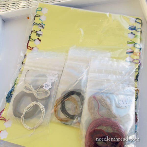
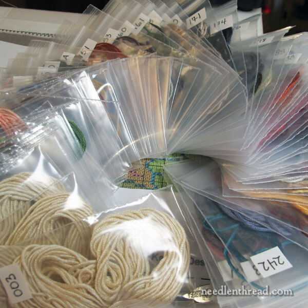
The first idea I’ve really taken to is the one regarding storage of the thread from the kit needed to complete the project.  You can read her idea for yourself below but, essentially, she decided to store the threads in clear zip lock bags so she could see the colours straightaway.  She has marked each bag with the DMC colour reference in the top right hand corner – and the extra clever bit, is that she has stored them in numerical order on a ring by punching holes into a corner of the bag.  So she has created a kind of carousel effect and can then easily flip through the bags until she finds the one she needs next.  Until now, I have stored my skeins of floss in small brown envelopes – albeit with the numbers written in the corner – but I really like the notion of having the colours immediately visible so I may well be updating my thread storage in the not too distant future.

Here’s Mary’s blog post so you can read it for yourself:

Earlier in January, we looked a stitching project that’s in my project rotation for 2017. It’s this miniature Tree of Life tapestry kit designed by Natalia Frank. The piece is worked on 56 count silk gauze, using silk threads – some 89 glorious colors of silk!

I showed you how I set the project up here, and today, I’ll show you progress on it and chat about getting my “stitching legs” on this one. I think it took me a lot longer than it takes most people to get their sea legs!

As I started the piece, cheerfully making mistakes along the way, I slowly mapped out a sensible strategy for stitching it that would reduce the chance of my making future similar mistakes. I also decided to take a different approach with thread organization. And I applied some of the typical stitching strategies that I use, no matter what project I’m working on.

Let’s take a look, shall we?

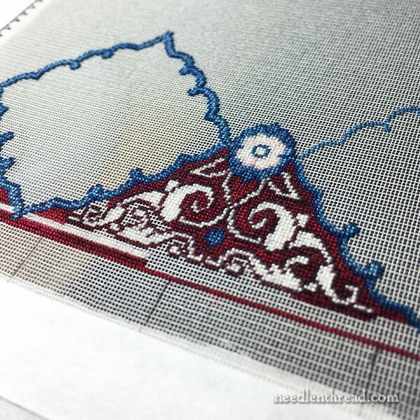
Part of border design of Tree of Life tapestry

Many small counted projects start in the middle of the design and work outwards, using the “cross hairs” (the center lines, horizontal and vertical) on the chart to show you exactly where the center of the piece is, and then allowing you to count from those center lines outwards.

On larger pieces that involve many pages of charts, it makes more sense to start on an outside corner. To do this, you have to work out the boundaries of the project – the number of stitches both vertical and horizontal that comprise the very edge of the project all around.

In this case, I counted the little squares in the silk gauze and marked the corners that would contain the design area with a tiny micron pen.

Starting in the Lower Corner

I began stitching in the lower left corner, because it was simply more convenient. In fact, it might be better to start stitching this type of thing at the top somewhere, so that your arms aren’t tempted to rest on already-stitched areas as you work up from the bottom. But I figure I can cover the stitched areas with tissue paper if I need to.

One reason it’s easier for me to start at the base of a frame is that the base is closer to me. I stitch without my glasses on and without magnification, and I can see it best, closer.

In starting out, it took me a while to get into the swing of counted work again. I began by working the blue scrolly frame element in the corner and some of the decoration around it.

I managed to make a few counting mistakes as I went. Fortunately, none of them were in the structure of the overall piece – they were just within the design area where I was working, without pushing the whole piece’s structure out of whack. Therefore, I left the mistakes. They’re so tiny, they aren’t really noticeable. I’m pretty sure I’m the only one who could find them, if pressed.

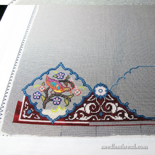
Corner of tapestry in progress

Once I finished the first corner frame and some of the embellishment around it, I decided to jump in and do the bird that goes in that corner.

And this is what I really like about this whole piece – the variety is pretty amazing! If I get bored with working in one area, I can move to another. I was a little bored with working the frame, so I jumped into the bird medallion in the corner.

Relatively speaking, these little colorful bird bits work up pretty quickly. And they’re very satisfying.

But notice that I didn’t finish it. I didn’t quite get the background in, and there’s a reason for that. I’ll tell you in a minute.

Parking threads

After many hours’ labor (it really isn’t labor!) on the beginning of the frame and the little corner bird, I decided to move on to the lower panel on this piece, which is an elongated inset of mountains, a dog, a rabbit, flowers, grasses, tree and sky.

There are lots of little design elements within each inset in the frame on this whole piece, and I really like that fact, because it keeps things interesting.

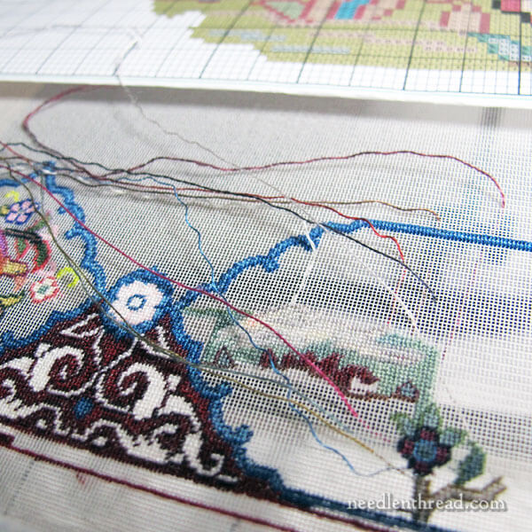
Parking Threads

At the same time, the whole thread-changing thing can be a drag. So I park my threads and swipe them out of the way. Instead of turning the frame multiple times to end threads, I just end a bunch of them at one time, usually at the end of a stitching session…

…or when I get tired of the build-up of parked threads!

Changing My Strategy

During the stitching of this panel on the frame, my approach to the rest of the project changed drastically.

At first, I thought I would stitch one area of the frame at a time, and then the inset scene inside that part of the frame. Then I’d move on to the next area of the frame.

I realized it would make a whole heck-of-a-lot more sense to stitch all the blue scrolly frame parts and have them finished. That way, I’d have the entire structure of the piece worked out already, and then it was just a matter of filling in designs either in the insets, or in the decorative part of the frame, leaving the center field (the largest “picture” on the piece) for last.

Changing My Thread Arrangement

The other decision I made was in the arrangement of the threads.

Organization of threads

For the panels and the central field, the thread in the kit was arranged on a large card with holes punched and numbers next to the holes and in numbered plastic bags.

Each time I had to change colors, I scanned the large card for the number and fumbled through all the plastic bags, until I found it. The colors on the chart don’t necessarily correspond with the color of the floss. The chart is designed with a DMC color scheme (because that’s what most designer programs provide), but the silk substitutions are often very different colors indeed. So I couldn’t use my eyes to find the brownish color I saw on the chart, because chances are, that symbol on the chart really represents a purple in the silk.

It took me a while to get used to that and to figure out a different way to arrange the threads so that I could find the thread I wanted more easily.

Threads all neatly organized

As you can see in the picture, I decided to repackage the threads, putting all the threads on the card and all the threads in the bags into smaller individual zip lock bags, all the same size, and numbering them in the outer right corner of the bag. I punched holes in the corners of the bags, and strung them in numerical order on a large ring.

This way, I can hang the ring on my stand, and when it’s time to switch colors, I just flip through the numerically ordered bags right to the color I need.

All the threads are held fairly compactly on the ring and in one place, making it easier to clean up at the end of a stitching session, too.

Click here to read the original article: http://www.needlenthread.com/2017/02/56-count-strategies-for-stitching.html

I was glad to find I’m not the only person who has trouble distinguishing between brown and purple – especially in artificial light! So I’m looking forward to saving time and effort using Mary’s strategy very soon.

  • « Go to Previous Page
  • Page 1
  • Interim pages omitted …
  • Page 4
  • Page 5
  • Page 6

Get In Touch!

Facebook

(opens in new tab)

Pinterest

(opens in new tab)

Twitter

(opens in new tab)

Additional Resources

FAQ

About Us

Contact Us

Disclosure

This page may contain affiliate links. This means we may receive a commission if you click a link and purchase something that we have recommended. While clicking these links won't cost you any extra money, they will help us keep this site up and running. Please check out our disclosure policy for more details.

© 2018 Crafty Bug. All Rights Reserved.

[footer_backtotop]

  • Privacy Policy
  • Terms and Conditions
  • Affiliate Disclosure
  • Contact Us
  • Sitemap
By continuing to browse the site you are agreeing to our use of cookies